StatusConcept brand — not affiliated with Woodstock Ventures
YearSpring 2026 — Rhetoric & Persuasion, GD-342
Woodstock took place August 15–18, 1969 in Bethel, New York. Planned for 50,000 attendees, it drew over 500,000 and quickly became more than a music festival — a moment where music, youth identity, and political values converged, and a defining symbol of the 1960s counterculture.
Woodstock naturally created a strong visual culture, distinctive fashion, and powerful symbolism; however, the event itself lacked a cohesive brand identity. By organizing these visual elements into a clear brand system, this project reinterprets Woodstock’s aesthetic and values into a contemporary fashion brand that can stand out within the apparel market.
Woodstock 69’ speaks to 18–30 year olds engaged with music culture, festivals, and expressive fashion, and to 25–40 year olds who appreciate vintage aesthetics and counterculture history. The tone is raw, expressive, anti-establishment, nostalgic but reinterpreted, and handmade — built on self-expression, peace and unity, DIY craftsmanship, and an anti-commercial rebellion it openly acknowledges is ironic.
Woodstock 69’ — Apparel
Apparel — 01/06
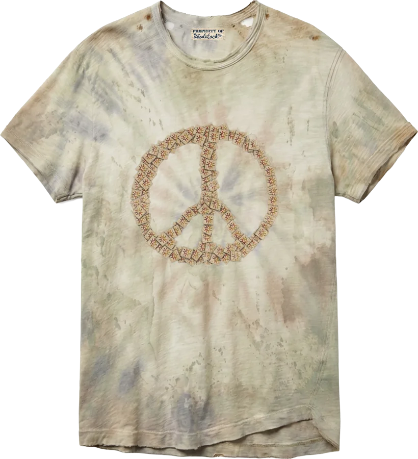
Acid Tab Peace Tee
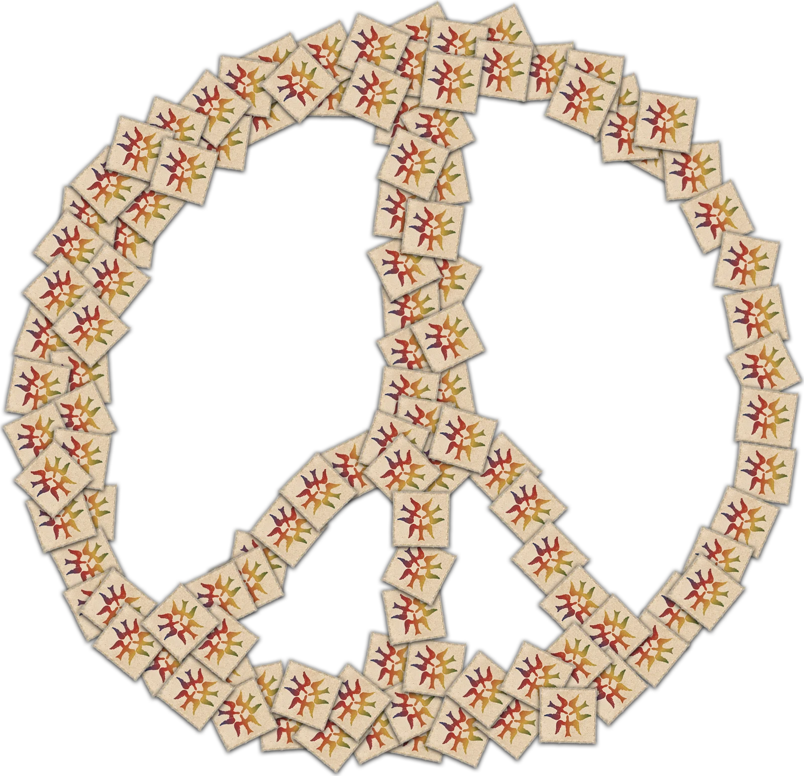
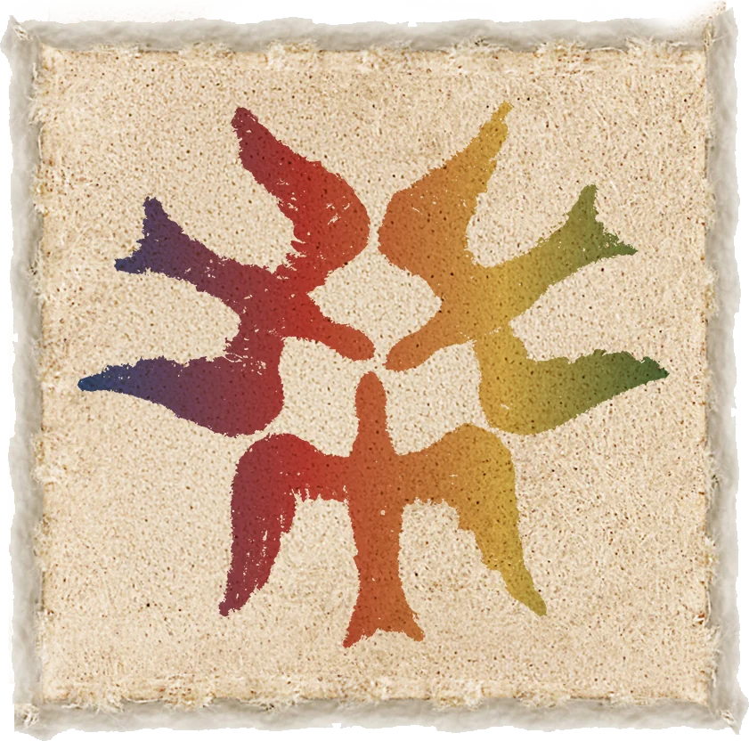
A peace sign built from tiny acid-tab tiles, printed on a washed tie-dye tee.
Graphic
Acid Tab PeaceAcid Tab
Apparel — 02/06
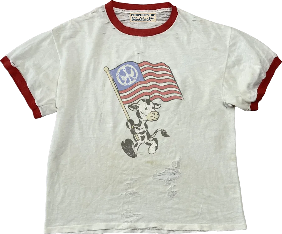
Flag Flyer Mascot Ringer Tee
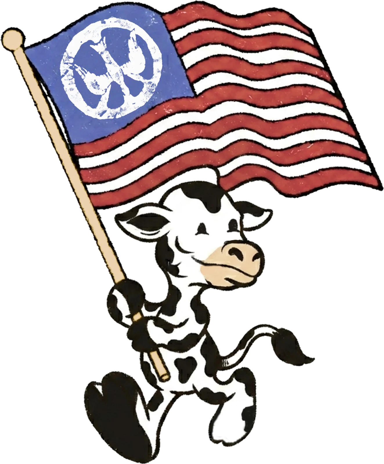
The cow mascot running with the peace flag, on a cream ringer with red trim.
Graphic
Flag Flyer mascot
Apparel — 03/06
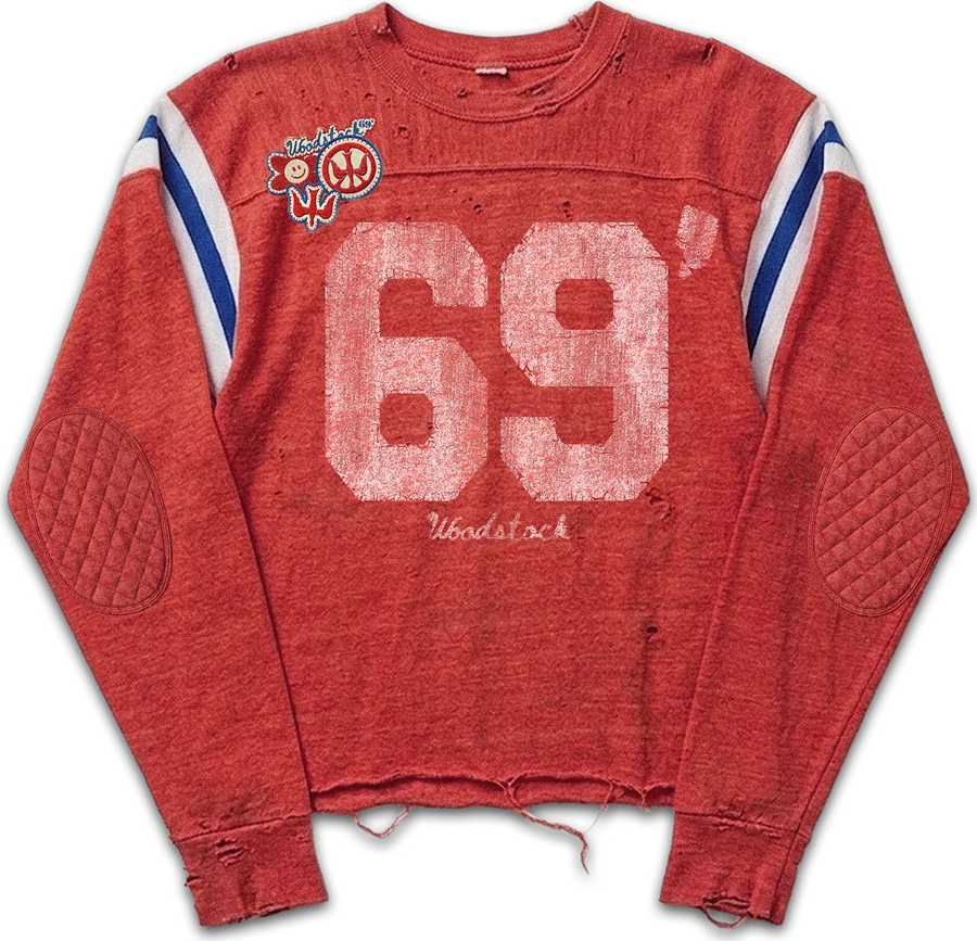
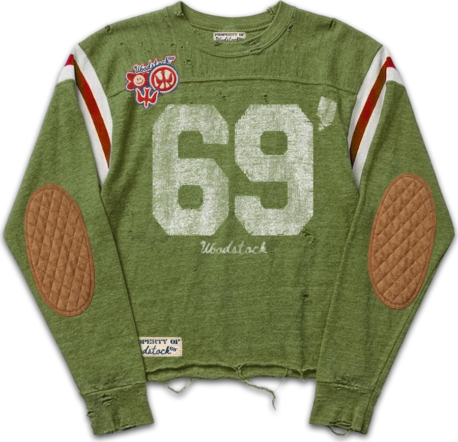
Camp Captain Football Jersey
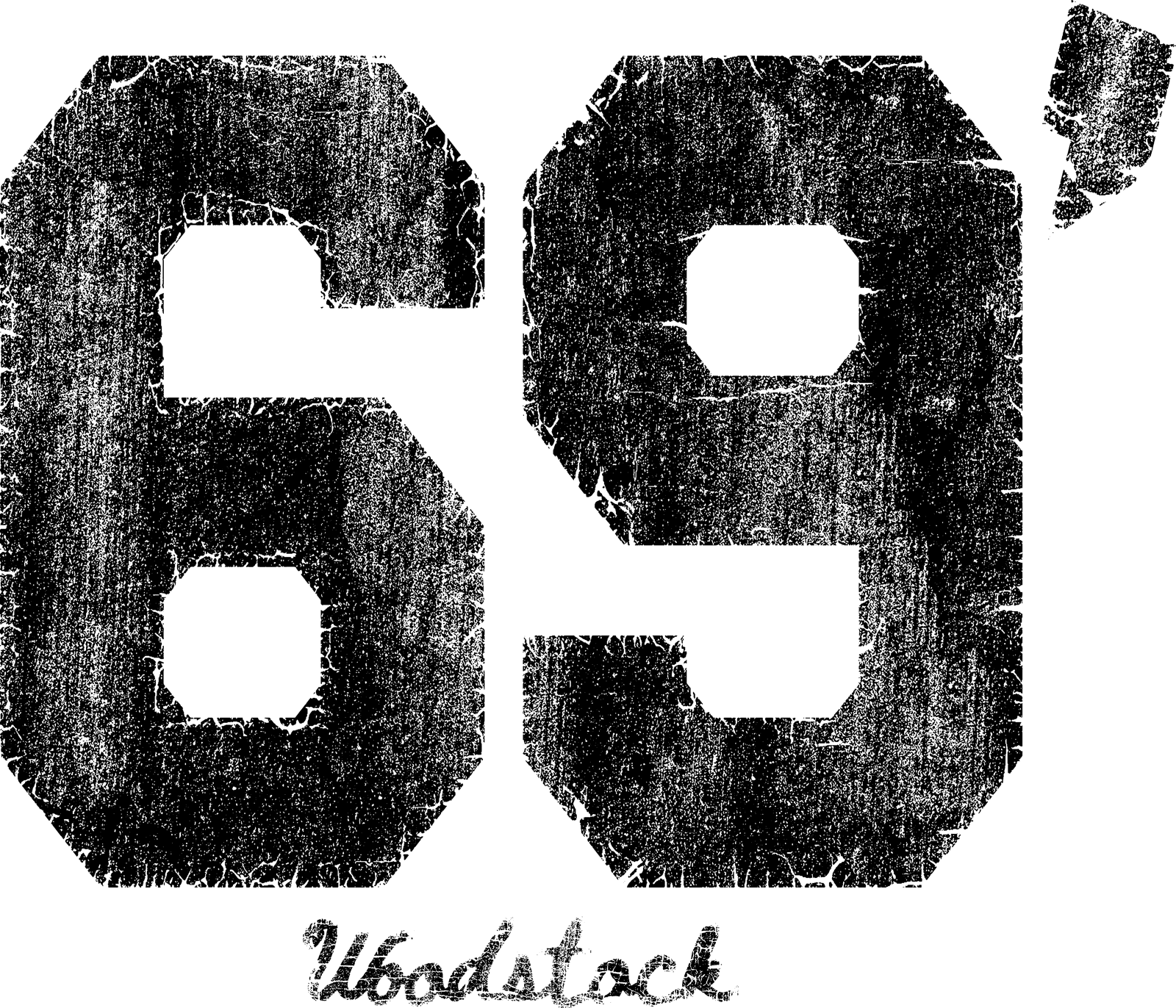
Cropped, distressed football jerseys with striped sleeves, quilted elbow patches, and cracked 69’ numerals.
Graphic
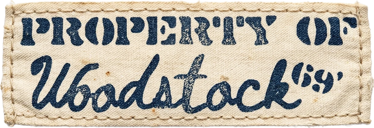
69’ varsity numeralsClothing label
Apparel — 04/06
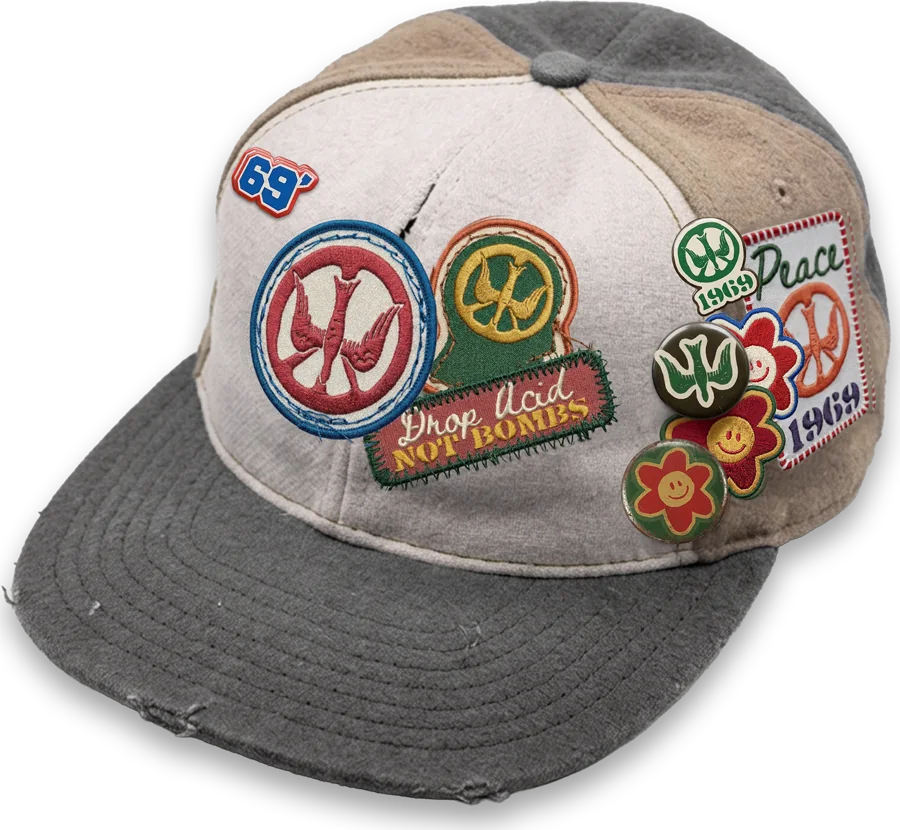
Collectors Ball Cap
A washed two-tone trucker loaded with patches and pins.
Graphic
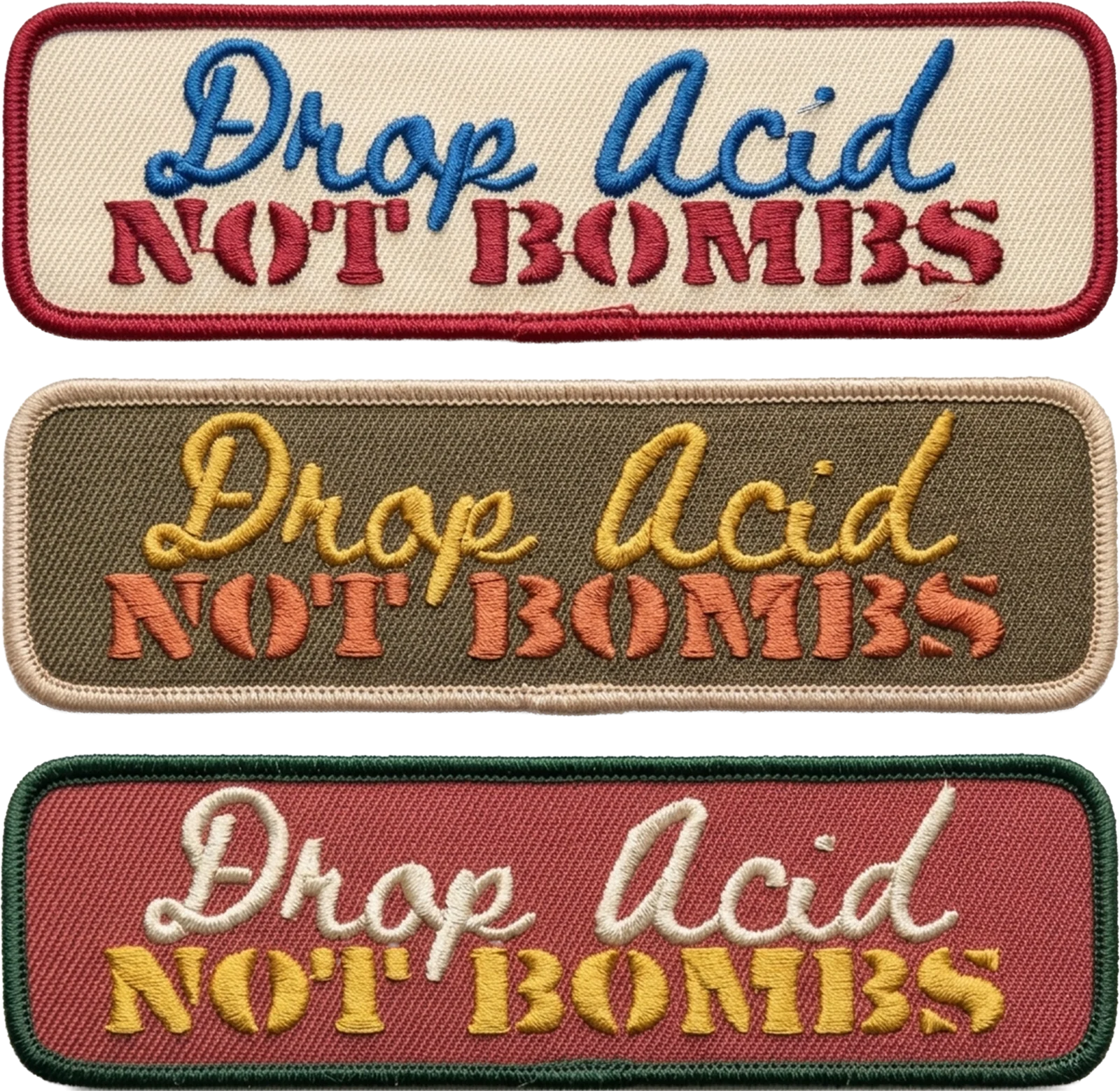
69’ patchesDrop Acid Not Bombs
Apparel — 05/06
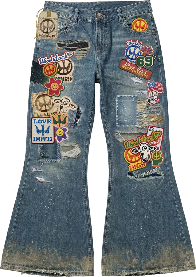
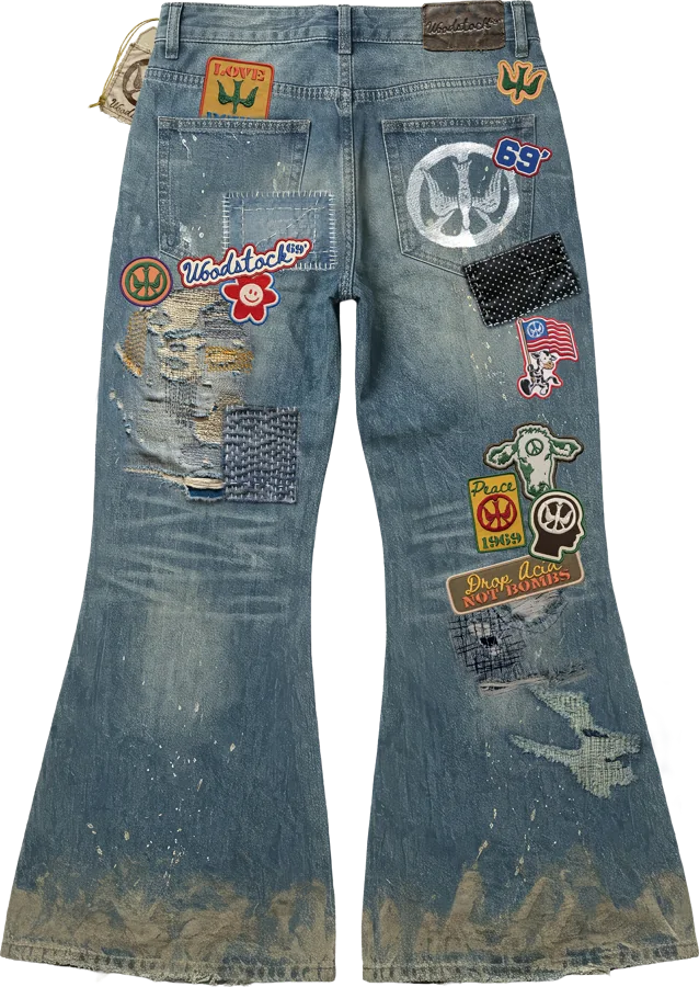
Muddy Patchwork Wash Flared Jeans
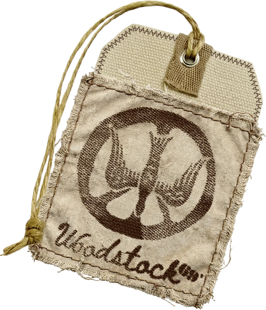
Distressed flares layered with the full patch system and repair stitching, finished with a stamped canvas hangtag.
Graphic
Patch collageHangtag
Apparel — 06/06
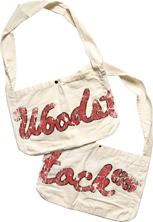
Tote Bag
Canvas shoulder totes with the hand-script wordmark in distressed red. Not for purchase.
Graphic
Wordmark
01
Logo Suite
Wordmark, icon, icon + wordmark lock-ups, and the alternate icon isolated and repeated.
IconDove in peace signIcon + wordmark lock-upStackedAlternate iconIsolated + repeated
Icon + wordmark lock-upHorizontalWordmarkLogo Suite
02
Colors
Brand palettePurple, orange, yellow, blue, red, offwhite, brown, green
03
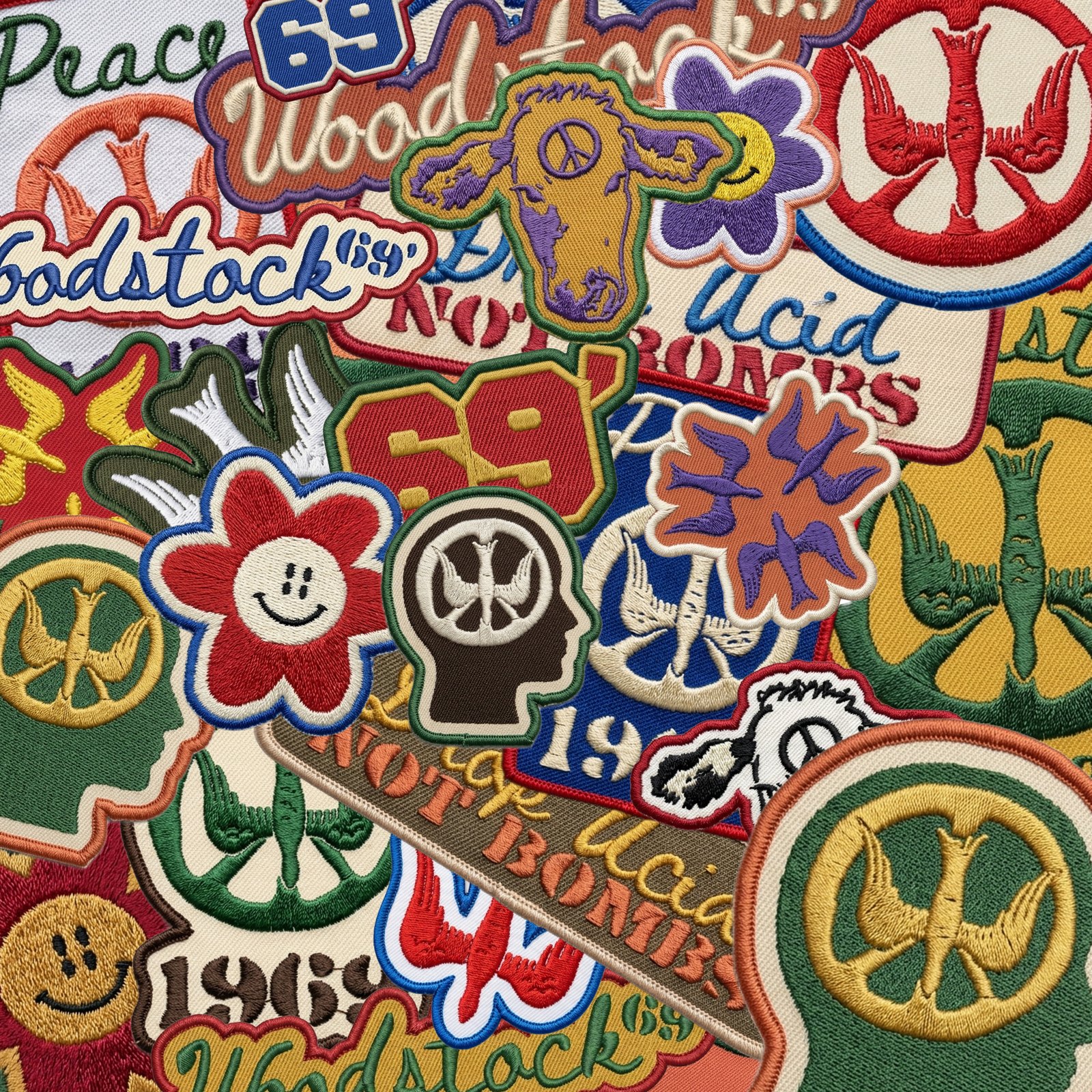
Designs in Use — Patches + Pins
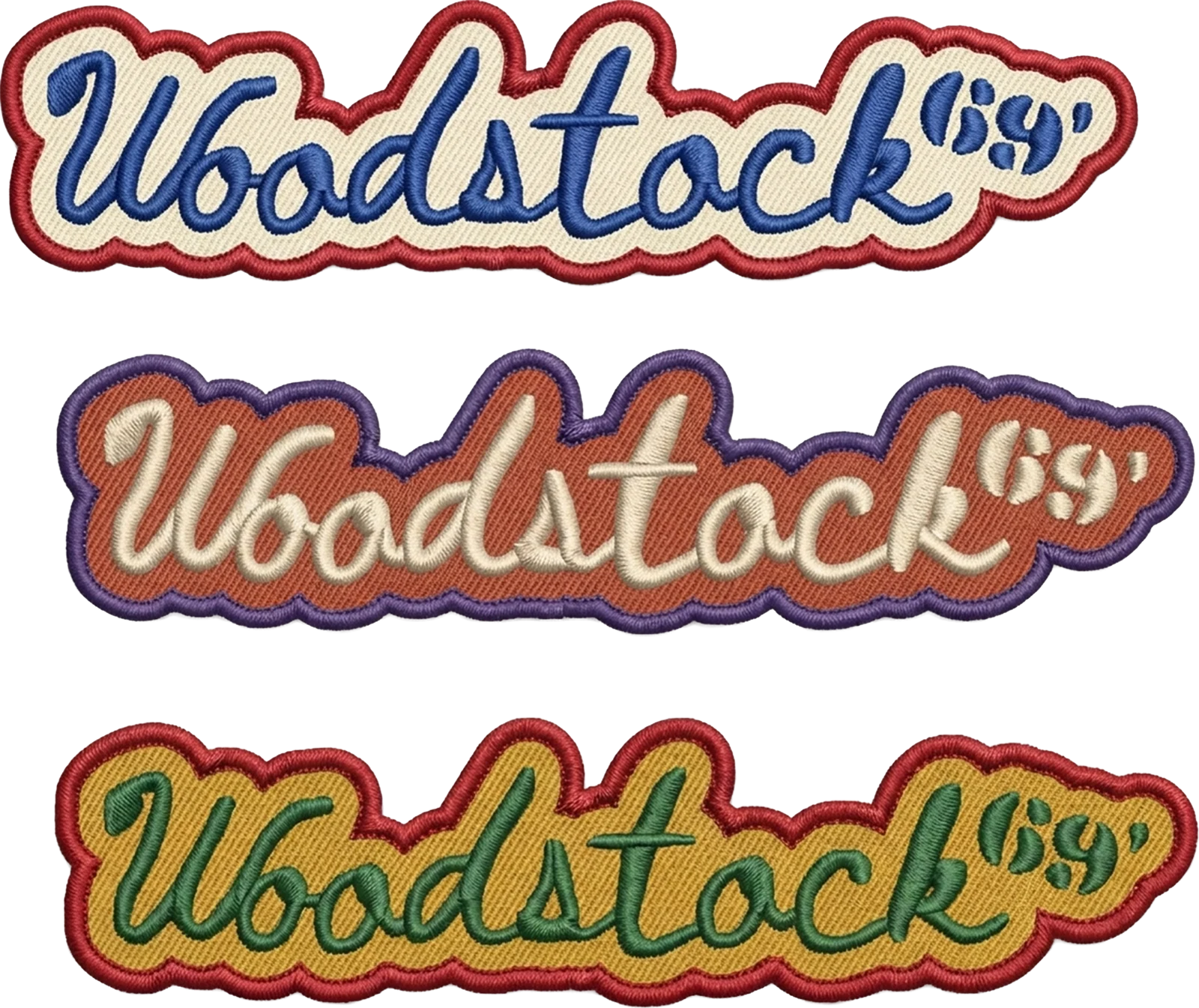
Wordmark patchesDesigns in Use — Patches + PinsWoodstock 1969 patchesDesigns in Use — Patches + PinsFlag Flyer mascot patchDesigns in Use — Patches + Pins
Peace 1969 + Love DoveDesigns in Use — Patches + PinsDrop Acid Not BombsDesigns in Use — Patches + PinsDoves, flowers + 1969Designs in Use — Patches + Pins
Cows, heads + peace roundsDesigns in Use — Patches + PinsWoodstock 1969 + 69’Designs in Use — Patches + PinsPinsDesigns in Use — Patches + Pins
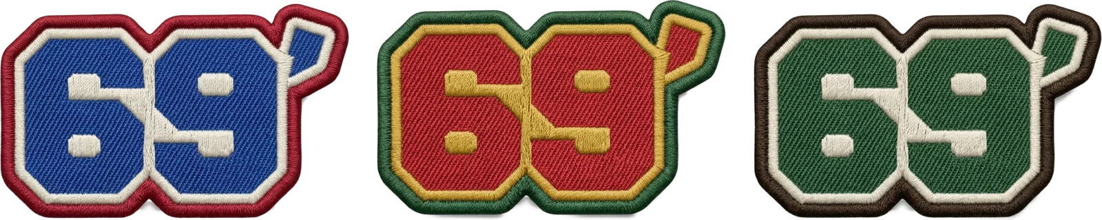
69’ patchesDesigns in Use — Patches + Pins
04
Designs in Use — Shirts
Flag Flyer mascotDesigns in Use — ShirtsAcid Tab PeaceDesigns in Use — Shirts69’Designs in Use — Shirts