
Art Direction · Visual Identity · Experiential Design
Tools & techniquesNòn·na is a refined Italian dining concept built on the idea that true luxury lives in restraint. Named after the Italian word for grandmother, it draws from the warmth of a family kitchen while carrying the poise of modern design — sophisticated without going cold, nostalgic without tipping into kitsch, for an audience of well-traveled professionals and creatives who wanted a place to socialize, not just eat.
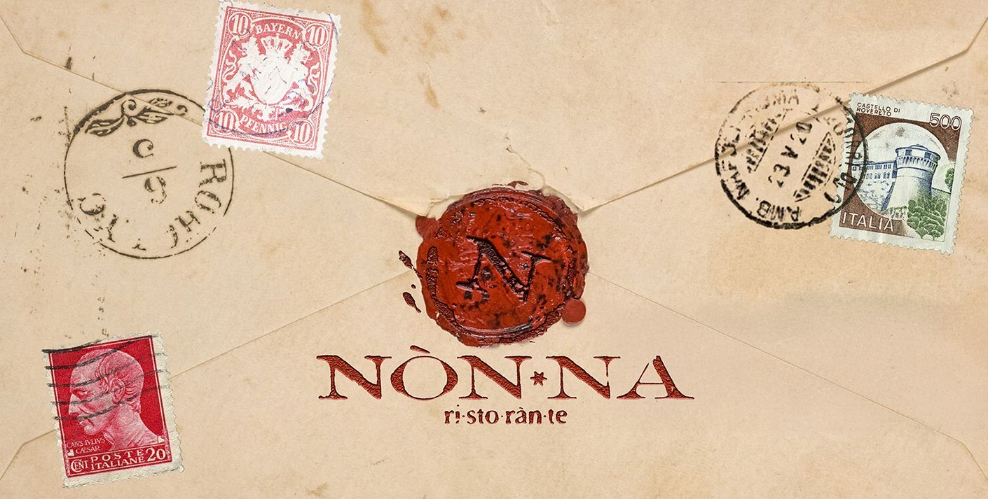
Vintage Italian postage stamps, wine-glass rings, and wax seals became the visual vocabulary — tactile, imperfect, human. Deep wine red, olive umber, and soft cream ground it in material honesty, and the logo, a stamped, slightly worn monogram, was built to feel like it had been in use for decades.
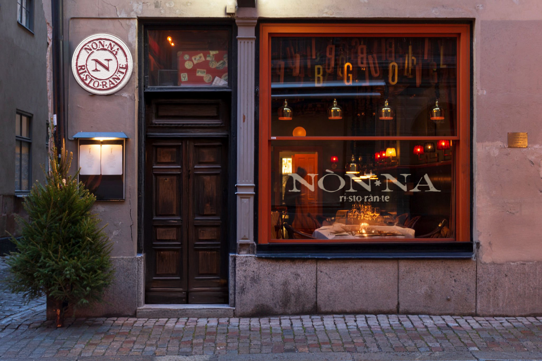
The system carried across the full experience — parchment menus, wax-sealed envelopes, signage, napkins, aprons, espresso cups, tote bags, and an art-directed Instagram presence. Nothing was templated; everything was considered.